NCPLOT: Area Charts
From BAWiki
General
The visualisation of a data set as an area diagram is described in a so-called Layer.
The assignment of colors to values of a data set and the form of representation
of the underlying geometry are set in one layer block of the steering file.
Different layers can be plotted lying upon each other.
The map view (horizontal plane) differs fundamentaly from the illustration using
area charts with axes.
Instead of specifying the image area and axes definitions, the relationship
between world and image coordinates is described using a so-called
Normalization_Transformation.
Color legends used by a layer can be displayed on the scene and can be arranged
horizontally or vertically.
Another layer dependent, optional image element is a text field
for the data label (e.g. Indication of the time).
Also simple data operations can be executed (addition, subtraction,
multiplication, division, absolute value, square root).
Types of area charts
Map, or top view illustration
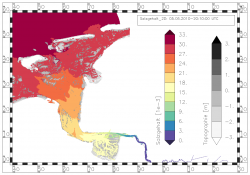
Scaled maps, or top view representation of simulation or analysis results.

Options of presentation
The data are presented by the program at their original positions (node, edge, face). A horizontal interpolation of the data is also possible. In addition to the fill area symbolization the data can be visualized by line symbolization by marker symbols or text. For edge and polygon data, there are also the possibilities of point-symbolization. In this case the marker or the text is positioned at the middle of the edge or at the polygon center. The edges of polygons can be also visualized by lines symbolization.
The sample pictures illustrate the capability of the program NCPLOT.
Example Figures: Map View
Coordinate frame
Each map can be framed. The type of frame can be a simple black edging or a complex frame with coordinates. The offered coordinate frames are optimized for values belonging to Gauss Krüger or to universal transverse mercator (UTM) projections. Different maps can be arranged in one picture.
Vector representation
If the X- and the Y-component of a vector quantity exists, the visualization of
the entire vector is possible.
Normal components of a vector quantity saved on edges can be visualized as a
normal vector of the edge or as an interpolated total vector.
The thin out of the display of vector arrows is possible.


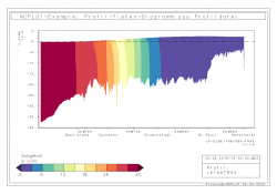
Vertical section
Representation of depth dependent, scalar simulation or analysis results along a profile axis (Picture 2).
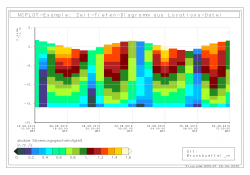
Time depth diagram
Representation of the temporal development of depth-dependent, scalar simulation or analysis results at a specific location (Picture 3).
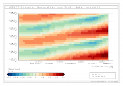
Hovmöller diagram
Representation of the temporal development of scalar simulation or
analysis results over a profile or locations axis.
variant PT: X-axis=profile axis, Y-axis=time axis (Picture 4).
variant TP: X-axis=time axis, Y-axis=profile axis (Picture 5).
back to NCPLOT
